Designing a room layout is so much more than just shuffling furniture around until it fits. It’s an art and a science—a process of creating a space that not only looks good but feels right. It all boils down to a few key ideas: finding your room’s natural center, carving out zones for different activities, and making sure you can walk through it all without bumping into things. It’s a delicate balance of scale, proportion, and, most importantly, how you live your life.
The Foundation of a Great Room Layout
Before you even think about lifting a sofa, let's talk about the core principles that guide every successful room design. These are the unspoken rules that make a space feel intuitive and welcoming. Get these right, and the rest falls into place. Skip them, and even the most expensive furniture will feel awkward and out of sync.
A poorly planned layout is a surprisingly common issue, often wasting 15-20% of usable space in today's homes. This lost potential has created a huge demand for smarter design tools. In fact, the global room planner market is on track to hit $2,671 million by 2032, as more people look for ways to make every inch count. This boom really highlights why a solid plan is your most important tool.
To get started, it's helpful to understand the foundational concepts that designers use to create functional, beautiful spaces.
Key Principles of Room Layout Design
| Principle | What It Means | Why It Matters |
|---|---|---|
| Focal Point | The dominant feature that first catches your eye. | It provides an anchor for your furniture and gives the room a sense of purpose. |
| Functional Zoning | Dividing a room into distinct areas for different activities. | Creates order, prevents chaos, and maximizes the room's utility. |
| Circulation | The pathways people use to walk through a room. | Clear pathways prevent the space from feeling cramped and awkward to navigate. |
| Scale & Proportion | How the size of furniture relates to the room and other objects. | Ensures a balanced, harmonious look where nothing feels too big or too small. |
Mastering these principles is the first step toward a layout that not only looks professional but also works seamlessly with your daily life.
Identify Your Room's Focal Point
Every well-designed room has a focal point. It's the star of the show—the first thing that draws your eye and the element around which everything else is arranged. It gives the room an immediate sense of direction.
Your focal point might be an architectural element that's already there, or you can create one yourself. Some classic examples include:
- A beautiful fireplace: This is a natural gathering spot, perfect for anchoring a cozy conversation area.
- A large window with a view: Don't hide it! Arrange seating to embrace the scenery and natural light.
- A striking feature wall: Think bold paint, dynamic wallpaper, or custom built-in shelves.
- A major piece of art or a statement mirror: When a room lacks a natural anchor, a large, compelling piece can create one instantly.
Once you’ve locked in your focal point, start arranging your main furniture pieces in relation to it. In a living room, for example, your sofa and chairs should generally face the fireplace or the main window.
A common trap is making the TV the default focal point. While it's often a necessity, ask yourself if another feature could create a more inviting atmosphere that isn't centered entirely on a screen.
The Power of Functional Zoning
Zoning is simply the practice of creating smaller, dedicated areas for different activities within a larger room. This is absolutely essential for open-concept homes, but it's a game-changer for any space. By creating distinct zones, you give every part of the room a clear job to do, which keeps it from feeling like a random jumble of furniture.
Start by thinking about all the ways you want to use the room. A single living room might need to serve several purposes:
- A conversation zone for gathering with friends, anchored by a sofa and armchairs.
- A media zone for movie nights, focused on the entertainment center.
- A quiet reading nook tucked into a corner with a comfortable chair and good lighting.
- A work-from-home spot with a slim desk and an ergonomic chair.
You can create visual separation between these zones using clever tricks like area rugs, distinct furniture groupings, or layered lighting. A well-placed rug, for instance, can instantly define a seating area and separate it from a nearby dining space. Applying this approach to interior design makes your layout more organized, intentional, and, ultimately, much more functional.
Creating Your Essential Floor Plan
An accurate floor plan isn't just a nice-to-have; it's the absolute foundation of any successful room design. This is where your ideas stop being abstract and start becoming a concrete, workable plan. Taking the time to translate your physical space into a to-scale diagram is what separates a thoughtful design from a frustrating mess of costly mistakes.
Think of it as your roadmap. Without one, you’re just guessing, hoping that beautiful sofa actually fits or that you can open the closet door once the bed is in place. A few minutes with a tape measure now will save you a world of headaches later.
Gathering Your Tools and Measurements
First things first, you need to get the room's precise dimensions. You don't need fancy gear—a trusty tape measure is a designer's best friend. If you're looking for speed and accuracy, a digital laser measure is a great investment that gives you instant readings.
Your mission here is to capture the room's complete architectural shell. Don't just measure the main walls. You need to be methodical and record every single element that will influence where furniture can (and can't) go.
Here's what to capture on your measurement checklist:
- Overall Room Dimensions: The total length and width.
- Wall Segments: Measure the length of each specific section of a wall, like the space between a corner and a doorway.
- Doors and Windows: Note the width of each opening and its exact distance from the nearest corner.
- Ceiling Height: This is critical for choosing furniture with vertical presence, like a tall bookcase or an imposing headboard.
- Permanent Fixtures: Jot down the location and size of anything that can't be moved, like a fireplace, radiators, or built-in shelving.
I can't tell you how many times I've seen a design plan derailed by a forgotten detail. Always, always mark the locations of electrical outlets, light switches, and air vents. This information is non-negotiable—it dictates where lamps can go, where your media center must live, and which walls are off-limits for big pieces that might block airflow.
From Measurements to a Visual Plan
With your numbers in hand, it’s time to make your floor plan visual. For years, designers relied on graph paper, letting each square represent a unit of measurement (say, 6 inches or a foot). It’s a classic for a reason and still works perfectly well for roughing out initial ideas.
But let's be honest, technology has given us a much more dynamic and efficient way to work. A digital floor plan lets you make adjustments on the fly and experiment in a way that paper just can't match. Instead of endlessly erasing and redrawing, you can drag, drop, and resize elements with a click, helping you cycle through different layout ideas in a fraction of the time.
Embracing Modern Design Tools
Modern tools can completely change the game here. Some platforms, for instance, can take a simple photo of your room and generate a to-scale model for you. This lets you skip the manual sketching process entirely and dive right into the fun part.
Imagine virtually emptying your room to test completely different arrangements and see how they feel in the context of your actual space. If you're ready to see how this works, you can explore what’s possible with a free AI interior design tool. It helps you bring your vision to life without all the heavy lifting, ensuring every piece you select not only fits perfectly but also enhances the overall flow and function of your design.
Mapping Functional Zones and Traffic Flow
You’ve got your floor plan, which means you’ve officially moved past the guesswork. Now for the fun part: layering in the human element. This is where we think about how you'll actually live, move, and interact in the room. It’s all about defining functional zones and establishing clear, unobstructed pathways—two ideas that work hand-in-hand to make a room feel completely intuitive.
Think of a functional zone as a designated area for a specific activity. Instead of seeing your living room as one big, empty box, you start to break it down into smaller, purposeful sections. This approach is what brings logic and order to your layout, making sure every last square foot has a job.
A single great room, for example, might need to wear several hats. You could map out:
- A conversation zone, anchored by a sofa and two armchairs facing each other over a coffee table.
- A media zone, with seating oriented toward an entertainment center.
- A reading nook, tucked into a quiet corner with a plush chair, an ottoman, and a dedicated task light.
- A small workstation with a slim desk against a wall, kept separate from the primary relaxation areas.
Each of these zones is like a mini-layout within the larger room, defined by its furniture grouping. One of the most effective tricks of the trade is to use an area rug to visually anchor a zone. It creates a clear boundary that separates it from other areas without putting up a wall. You can find some great professional examples in our collection of living room ideas to see how this technique creates harmonious, multi-functional spaces.
The Art of Creating Clear Pathways
Once you have your zones mapped out in your head, you need to connect them with clear pathways for movement. We call this traffic flow or circulation. It’s the invisible network of paths people will use to walk into, through, and out of the room. A layout with poor traffic flow feels cramped and awkward, no matter how beautiful the furniture is.
The key is to create direct and logical routes between doorways and your main functional zones. People should be able to move freely without having to weave around furniture or cut right through the middle of a conversation area.
A critical mistake I see all the time is designing zones in isolation without thinking about how they connect. You have to consider the journey. How does someone get from the hallway to the sofa? From the kitchen to the patio door? Your layout should guide them naturally along the path of least resistance.
This is why we start with the floor plan. The whole process—measuring the physical space, sketching out the dimensions, and then digitizing it—gives you a visual sandbox to map out both your zones and the pathways between them before you commit to moving a single heavy object.
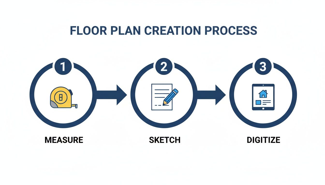
This simple three-step process is the foundation for testing different layouts and ensuring your traffic flow is both logical and spacious.
Applying Standard Measurements for Success
To make sure your pathways are genuinely comfortable, we rely on a set of standard clearance measurements. These numbers aren't random; they’re based on decades of ergonomic research into how people actually move within a space.
Always prioritize traffic flow in your initial planning. In my experience, a huge number of layout frustrations come from ignoring these basic pathway rules.
Here's a quick reference guide to keep on hand. These are the measurements I use every day to make sure a layout works in the real world, not just on paper.
Standard Clearance and Pathway Measurements
| Area | Recommended Clearance (Inches) | Purpose |
|---|---|---|
| Major Walkways | 36 inches | Main paths from entryways or between rooms. |
| Minor Walkways | 24–30 inches | Secondary paths, like between a sofa and a wall. |
| Coffee Table Space | 14–18 inches | From the sofa/chair edge to the coffee table. |
| Pull-Out Chair Space | 30–36 inches | Behind a dining or desk chair to allow movement. |
| Conversation Area | 48–96 inches | Between seating pieces to encourage interaction. |
Sticking to these standards will make a world of difference in how your room feels and functions. A non-negotiable guideline is to maintain at least 36 inches of clear width for major walkways, like the main path from a hallway into the living room. For smaller, secondary paths, you can dip down to 24 inches, but try not to go any tighter.
By mapping your zones first and then carving out generous pathways between them, you create a layout that isn't just visually appealing—it's fundamentally built for real life. It’s this thoughtful balance that transforms a simple room into a truly functional and welcoming home.
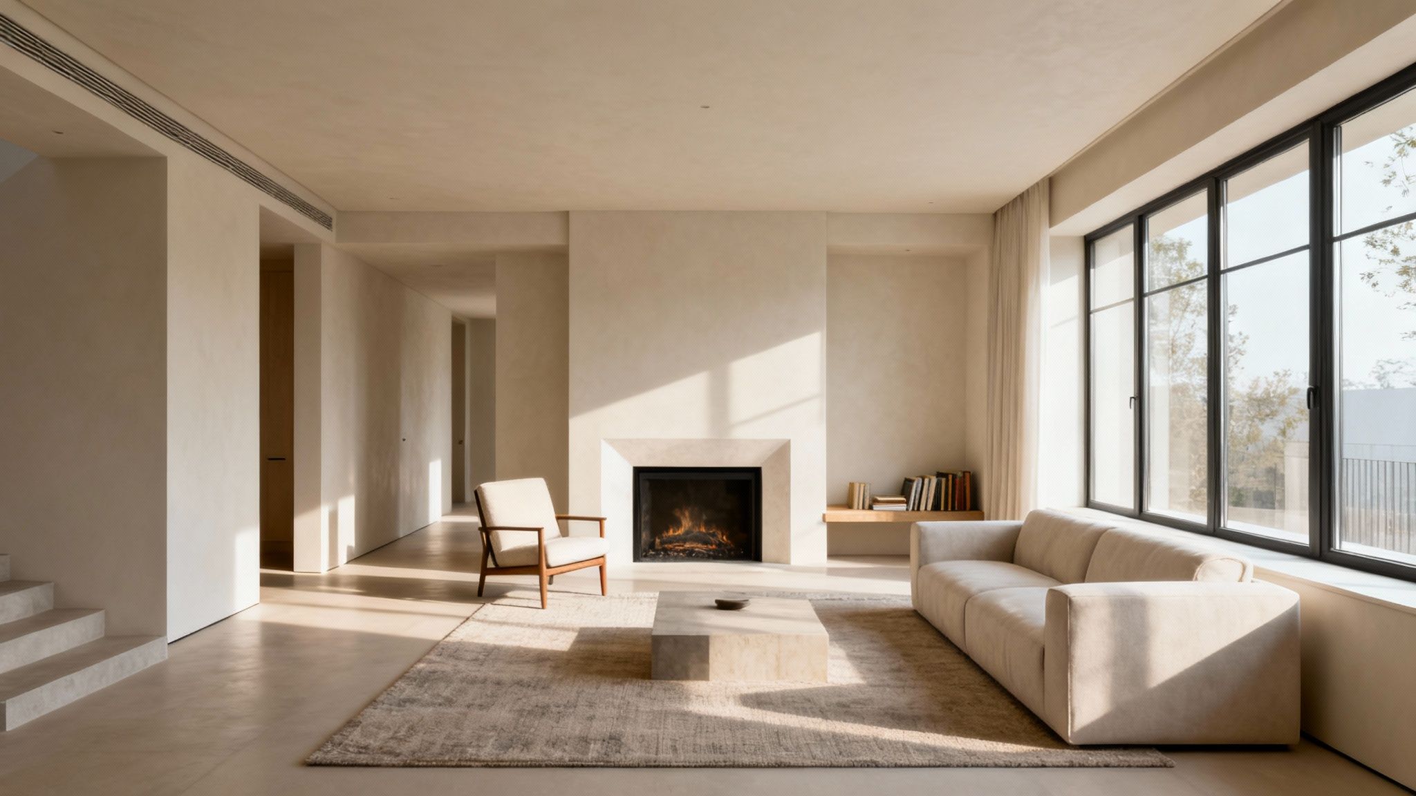
Placing Furniture for Function and Flow
You’ve mapped out your zones and sketched your traffic paths. Now for the fun part: placing the furniture and watching the room come to life. This is where your flat plan starts to feel like a real, three-dimensional space. It’s less about just filling the room and more about thoughtful placement that makes it both beautiful and genuinely usable.
The best way to start is by identifying your anchor piece. This is the big one—the largest, most important piece of furniture for that particular zone. In a living room, that's almost always the sofa. In a bedroom, it’s the bed. This single item acts as the gravitational center for everything else, so get it right first. Position it facing the room's natural focal point, whether that's a fireplace, a large window, or a media center.
Start with the Anchor and Build Outward
Once your anchor piece is in place, you can build the rest of the layout around it. A common rookie mistake is to shove the sofa right up against the wall. While that’s sometimes unavoidable in tight quarters, pulling it away from the wall—even just a few inches—instantly makes a room feel more spacious and airy.
In a larger room, don't be afraid to "float" the sofa in the middle of the space. This is a fantastic technique for carving out a cozy, defined conversation area, especially in open-concept homes. After the sofa is set, bring in your secondary seating, like armchairs, positioning them to encourage easy conversation.
I have one non-negotiable rule when arranging a room: every single seat needs a surface within arm’s reach. Whether it's a coffee table, a side table, or a slim C-table, this small detail is what makes a room feel truly livable, not just staged.
Getting the Visual Balance and Scale Just Right
With the main seating arranged, your next task is to create visual balance. This isn't about perfect symmetry; in fact, asymmetrical layouts often feel more modern and dynamic. The key is to balance the visual weight of your furniture. If you have a heavy, substantial sofa on one side, you can balance it with two lighter armchairs and a floor lamp on the other.
Pay close attention to scale, too. A huge, overstuffed armchair will dwarf a delicate side table next to it, throwing the whole vibe off. The goal is to mix pieces with different heights and masses to create a more curated, layered look.
Here are a few practical tips I always use to create a balanced layout:
- Vary Your Heights: Mix tall pieces like bookcases or floor lamps with low-slung items like coffee tables to guide the eye around the room.
- Play with Shapes: If your sofa is all straight lines, soften the look with a round coffee table or a chair with curved arms.
- Mix Solid and Leggy: Pair a solid, blocky sofa with chairs that have exposed legs. This simple contrast keeps a room from feeling too bottom-heavy.
This thoughtful mix-and-match approach is what makes a space feel intentional and professionally designed.
Using Modern Tools to Nail the Perfect Fit
Let's be honest, one of the hardest parts of this process is just visualizing how a piece of furniture will actually look in your space. Measurements on a page are one thing, but seeing it in context is something else entirely. This is where AI-powered design tools can be incredibly helpful.
For instance, if you're trying to find an armchair that perfectly complements your existing sofa, you could spend hours scrolling online. Or, you could use a tool like RoomStudioAI. Its visual search lets you upload an inspiration photo, and the tech instantly finds shoppable items that match the style and dimensions you need. You can "shop the look" right from your virtual design, which takes the guesswork out of buying. It bridges that gap between your imagination and reality, so you can purchase with confidence.
For more inspiration on creating a space that’s both functional and stylish, take a look at our guide on home office ideas, which puts these same principles of balance and flow into practice.
Layering Lighting and Accessories
A great room layout is about so much more than just where you put the sofa. The real magic happens in the final layers—the lighting, rugs, and accessories that transform a functional space into a place that feels personal, polished, and genuinely inviting.
Think of these elements as the punctuation in your room’s story. Without them, even the most perfectly arranged furniture can feel a bit flat or unfinished. These are not afterthoughts; they are the essential details that bring everything together.
The Three Layers of Essential Lighting
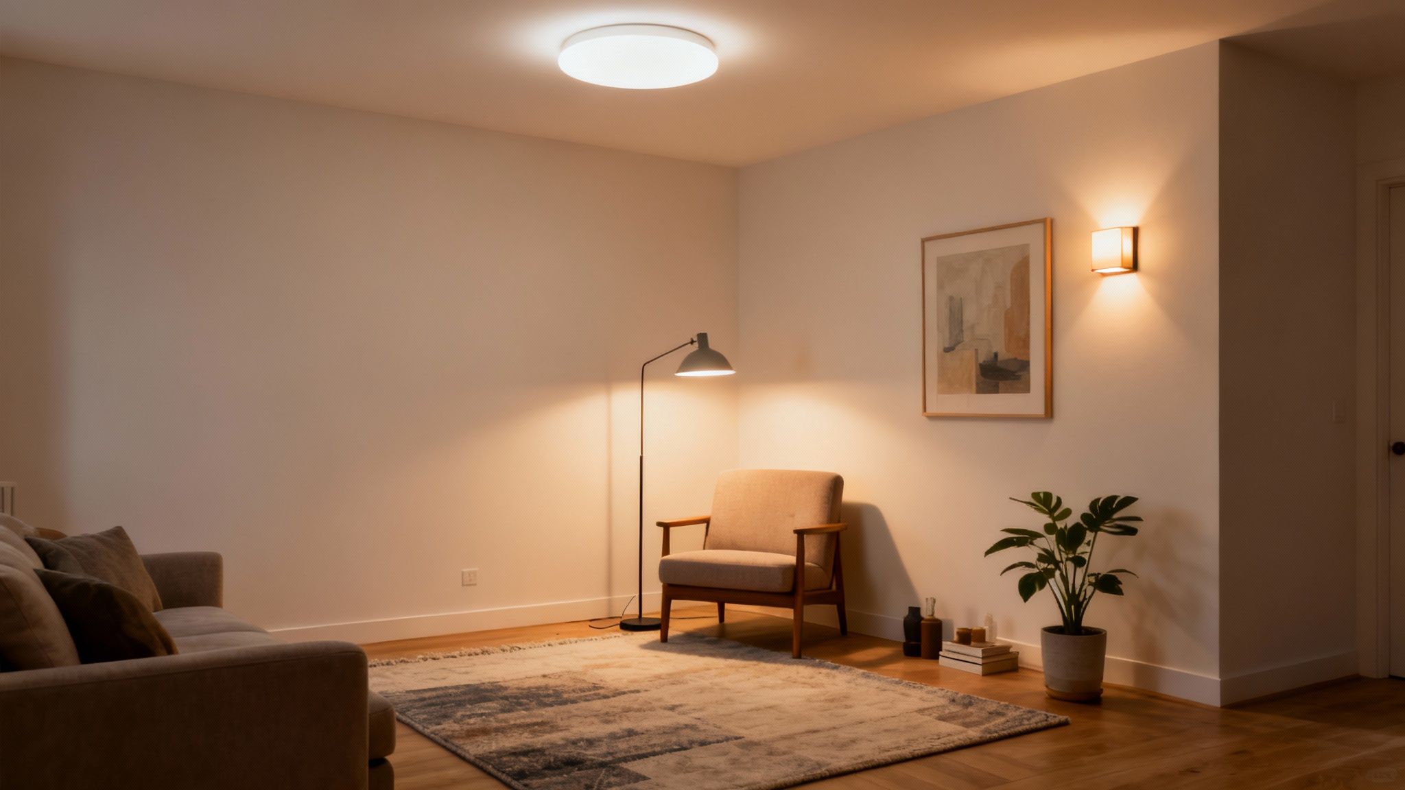
Great lighting is probably the most underrated tool in interior design. Ditching that single, lonely overhead fixture for a layered approach is one of the best moves you can make. A truly well-lit room uses three distinct types of light to build atmosphere, support different activities, and showcase your favorite features.
- Ambient Lighting: This is your foundation—the general, all-over light that lets you navigate the room safely. It’s usually provided by ceiling fixtures like chandeliers, flush mounts, or recessed lighting.
- Task Lighting: Just like it sounds, this is focused light for getting things done. A reading lamp by your favorite armchair, under-cabinet lighting for chopping veggies, or a desk lamp for late-night work are all perfect examples.
- Accent Lighting: This is the fun part. Accent lighting is all about creating drama and drawing the eye. Use it to highlight a piece of art, graze a textured wall, or uplight a beautiful plant.
By weaving these three layers together, you give the room incredible depth and versatility. That cozy reading nook isn't truly complete without its task lamp, and the architectural detail you love deserves its own spotlight.
Anchoring Your Zones with the Right Rug
If there's one mistake I see time and time again, it's the "postage stamp" rug—that tiny little mat floating adrift in the middle of a room. A rug that's too small actually makes a space feel more cramped and disjointed. The right rug, on the other hand, acts as an anchor, visually tethering a furniture grouping and defining the zone.
A simple rule of thumb: at least the front two legs of every major piece of furniture in a conversation area should be on the rug. This means your sofa and armchairs are all connected, creating one cohesive, unified space.
In a dining room, the rule is a bit different. You need a rug that’s large enough for the chairs to remain completely on it, even when you pull them out to sit down. Nobody likes a wobbly, half-on-half-off chair during dinner.
Placing Accessories with Purpose
Now for the final, personal touches. Accessories are where you get to inject your own personality into the space, but the goal is curation, not clutter. Every object should feel intentional, whether it's there for its function, its beauty, or its sentimental value.
When hanging art, aim for eye level—the center of the piece should be about 57-60 inches from the floor. Mirrors are brilliant for bouncing light around and creating an illusion of space; just be sure to place them where they reflect something worth seeing. And don't forget plants! They add life, texture, and an organic element that softens any room.
Even as you add these finishing touches, never lose sight of function. It's no surprise that kitchen designs, where practicality is king, recently topped user projects at 32%. This reinforces a core design principle: data shows that 70% of interior satisfaction is tied directly to a room's functional layout. To see how these priorities are shaping homes worldwide, check out the latest global home design study.
Common Room Layout Questions
Even with the best plan in hand, you’re bound to hit a few snags or second-guess a decision. That's a completely normal part of the design process. To help you push through those moments of doubt, I've rounded up some of the most common questions that come up when laying out a room.
Think of this as a quick-reference guide from someone who's been there. These are the real-world problems designers solve every day, and the answers will help you troubleshoot your own space with confidence.
What's the Single Biggest Mistake People Make?
Hands down, the most frequent misstep I see is getting the scale of the furniture wrong. It’s a classic Goldilocks problem. A massive sectional crammed into a small den makes the room feel suffocating and claustrophobic. On the flip side, tiny furniture floating in a large, open-concept space can look lost and uninviting.
Running a close second is the habit of pushing every piece of furniture against the walls. It seems like a safe bet, but it actually creates a weird, awkward "dead zone" in the middle of the room and makes conversation feel like you're shouting across a canyon.
The fix is simple: measure everything. Measure your room, and then measure the furniture you’re considering. A great little trick is to use painter's tape to outline the footprint of major pieces like a sofa or bed right on your floor. It’s a low-tech way to see exactly how much space something will really take up.
How Do I Figure Out the Focal Point?
Every great room has a focal point—it’s the first place your eyes land when you enter. Sometimes, the architecture hands it to you on a silver platter: a beautiful fireplace, a big bay window with a view, or a charming set of built-in bookshelves. If you have one of these, your job is half done.
But what if your room is just a plain box? No problem. You get to create the focal point yourself. Here are a few ways to do it:
- A statement piece of art: A large-scale painting or a gallery wall of photos instantly draws the eye.
- A unique piece of furniture: Think of a sofa in a bold velvet, a dramatic four-poster bed, or an eye-catching media console.
- An accent wall: Painting one wall a deep, moody color or covering it in a dynamic wallpaper creates an immediate anchor for the entire room.
Once you know your focal point, you can arrange your main furniture grouping to honor it. This simple act gives the layout a sense of purpose and makes the whole space feel more cohesive.
Can an App Actually Help Me Design My Room Layout?
Absolutely. Technology has come a long way, and today's design tools take a ton of the guesswork out of the equation. AI-powered platforms are especially useful because they let you test-drive ideas without breaking your back moving furniture around.
Instead of just trying to imagine how that armchair would look in the corner, you can see it in a photorealistic render. It’s an incredibly powerful way to experiment, catch potential mistakes early, and feel confident before you commit.
For instance, a tool like RoomStudioAI lets you upload a photo of your room as it is now. The AI can digitally "empty" it for you, giving you a clean slate that still has your room's exact dimensions and lighting. From there, you can drag and drop new furniture, play with different configurations, and see what works.
How Much Space Should I Leave Between Furniture?
This is where design goes from art to science. Following a few key measurements is the secret to a room that feels effortless and easy to live in. We dive deeper into this in our guide to living room design, but here are the essential numbers to know.
- Sofa to Coffee Table: Keep 14 to 18 inches between them. This is close enough to set down a drink but leaves plenty of legroom.
- Main Walkways: You need at least 30 to 36 inches for any major traffic path, like the route from the hallway to the sofa.
- Conversation Zones: Seating should be 4 to 10 feet apart. Any closer feels crowded; any farther, and you have to raise your voice.
- Around the Dining Table: Leave a minimum of 36 inches between the edge of the table and a wall or other furniture. This gives people room to pull out their chairs and walk behind someone who is seated.
Ready to stop guessing and start visualizing? RoomStudioAI can turn a photo of your room into a design playground in under 30 seconds. Experiment with layouts, discover new pieces, and see your ideas come to life before you lift a finger. Try it today at https://roomstudioai.com.
Ready to redesign your space?
Try our AI interior design tool and see your room transformed in seconds.
Try Free Design

