Choosing a color scheme is less about following rigid rules and more about creating a feeling. It's about bringing your personality into a space. But if you're looking for a solid starting point that designers have relied on for decades, the 60-30-10 rule is your best friend.
Think of it this way: 60% of your room is your main color (usually the walls), 30% is a secondary color (furniture, curtains), and the final 10% is your accent (pillows, art). This simple ratio creates a visual balance that just feels right.
Understanding the Fundamentals of Color
Before you even think about paint swatches, let's talk about the basics. Every great design starts with the color wheel. It’s not just for art class; it’s a designer's secret weapon for understanding how colors talk to each other and influence the mood of a room.
The first, most intuitive concept is color temperature. Every color leans either warm or cool.
- Warm Colors: Think of a sunset—reds, oranges, yellows. These colors feel energetic and social. They have a way of advancing visually, making a large, cavernous room feel more intimate and inviting. A terracotta accent wall in a living room, for example, instantly adds a welcoming glow.
- Cool Colors: These are the colors of water and sky—blues, greens, and purples. They recede, creating a sense of spaciousness and calm. This is why they're such a natural fit for bedrooms, bathrooms, or any space where you want to unwind.
Building Your First Palette
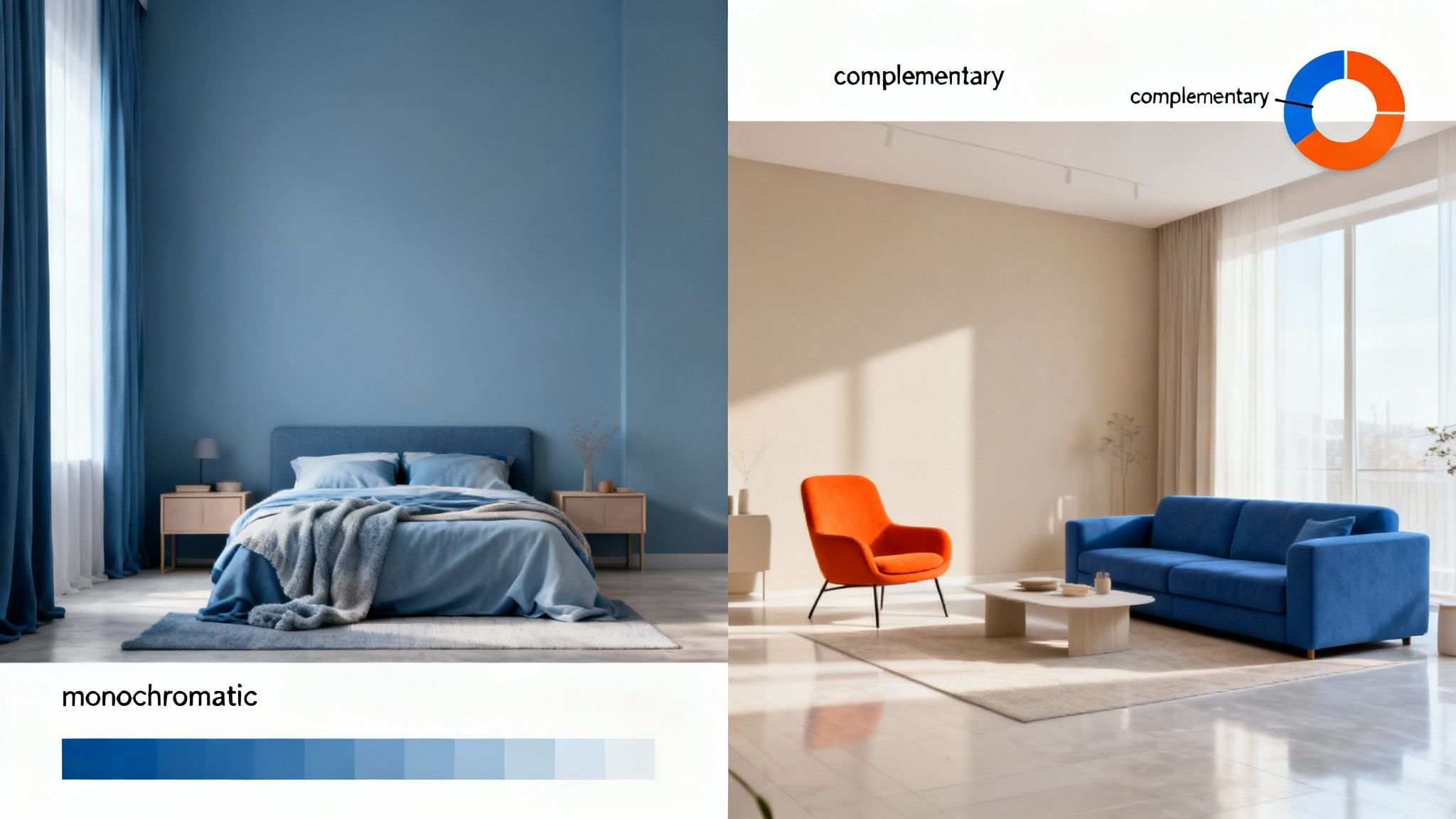
Once you have a handle on temperature, you can start building a palette using proven color relationships. These aren't unbreakable laws, just time-tested combinations that create harmony. The three most common approaches are monochromatic, analogous, and complementary. Each one delivers a completely different vibe.
A monochromatic scheme is wonderfully sophisticated. It works by taking one single color and exploring all its different shades, tones, and tints. Picture a bedroom wrapped in various blues, from a soft, hazy blue on the walls to a rich navy velvet headboard and light blue linens. It’s an incredibly chic and calming way to design.
Next up, an analogous scheme uses colors that are neighbors on the color wheel—like blue and green, or yellow and orange. This combination always feels harmonious and natural because it's what we see in the world around us. Think of a forest floor with its mix of greens, golds, and browns.
If you’re after something with a bit more punch, a complementary scheme is the way to go. This involves pairing colors from opposite sides of the color wheel, like the classic duo of blue and orange or the vibrant mix of red and green. The high contrast makes both colors pop, injecting a ton of energy into a room. It's a fantastic choice for a space where you want to spark conversation and creativity.
The real magic isn't just in the colors you pick, but in how they relate to one another. A truly successful scheme feels intentional, telling a cohesive story through either quiet harmony or exciting contrast.
Of course, imagining these combinations is one thing, but seeing them in your own home is another. Bridging that gap is where technology can be a huge help. If you’re curious about how these color theories would look in your space, you can explore AI-powered interior design concepts to get a realistic preview. It takes the guesswork out of the process, letting you commit to a new look with total confidence.
Tailoring Palettes for Every Room in Your Home
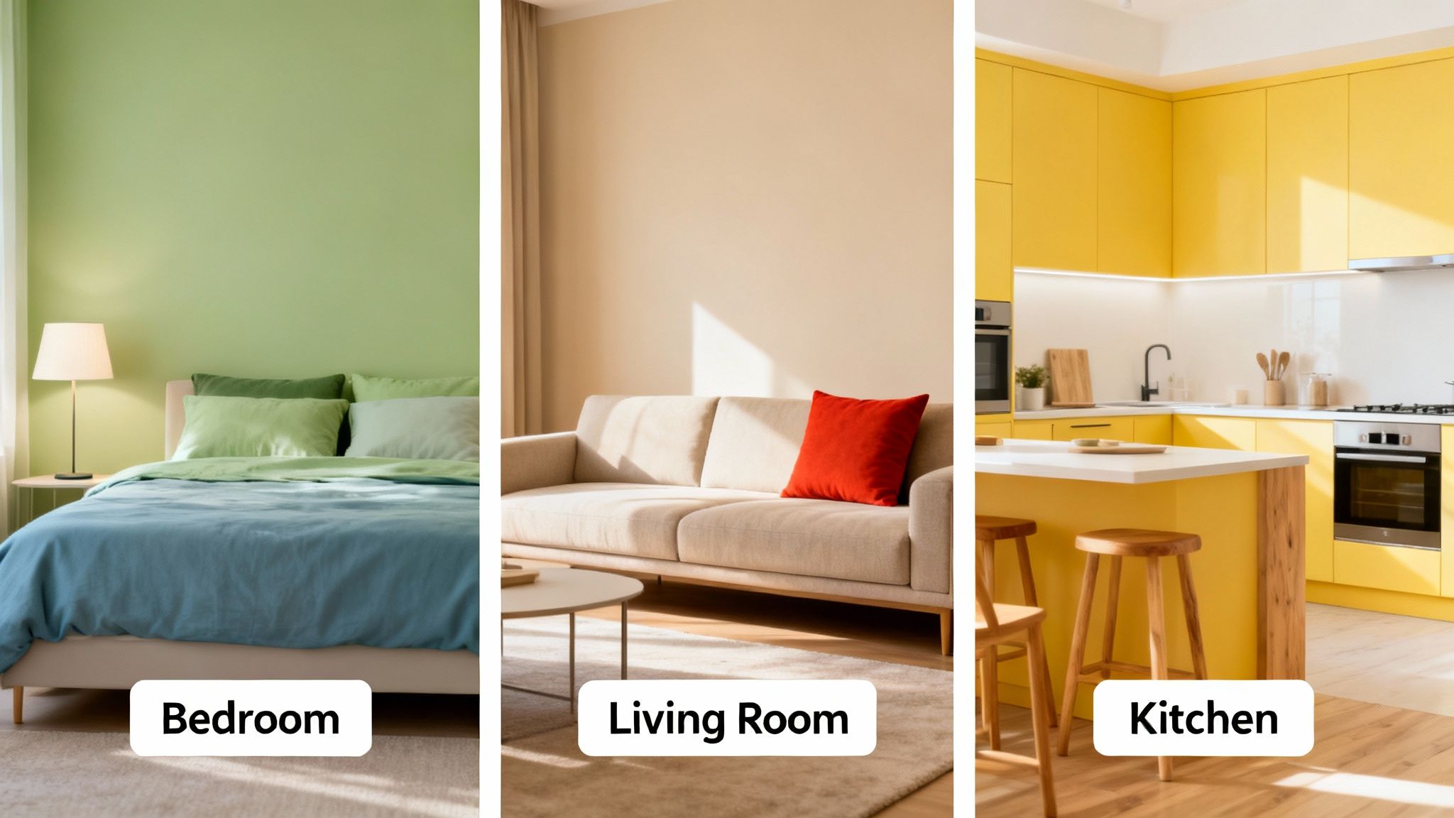
A color palette that makes a kitchen feel vibrant and full of life would probably feel jarring in a bedroom meant for quiet rest. This is the heart of effective interior design: understanding that every room has a different job to do. Color is your best tool for getting that job done right.
This is where color psychology moves from theory to practical application. Think about your bedroom—it’s a sanctuary. You want colors that are physically calming, and that means looking to nature. Soft greens, muted blues, and gentle grays are always winning choices here because they help lower stress and prepare the mind for sleep.
For a deeper dive into creating a restful space, we've gathered tons of visual ideas and palettes in our guide to beautiful bedroom design schemes.
Creating Social and Productive Atmospheres
Your living room is often a multitasking space, used for both relaxing evenings and lively gatherings with friends. This calls for a versatile color scheme. I often recommend starting with a foundation of warm, inviting neutrals like beige or greige. These create a comfortable backdrop that you can easily build upon. From there, you can inject personality with bolder accents—a rich navy, a deep teal, or a splash of burnt orange—through pillows, throws, or a statement piece of furniture.
Kitchens, on the other hand, are the energetic heart of the home and can handle much more saturated color. A sunny yellow can genuinely make the space feel more social and even stimulate appetite, while a deep, earthy green can make it feel grounded and connected to the outdoors.
This move toward natural, comforting colors isn't just a fleeting idea. The year 2023 saw a massive shift toward warm earth tones, with schemes using muted greens, soft yellows, and warm neutrals jumping 45% in popularity. Paint companies even reported that earthy tones made up 52% of all their color sales in the first half of 2023. It’s clear people are craving interiors that feel balanced and grounding. You can explore more about these interior design trends and how to use them.
Designing for Focus and Drama
Not every room needs to be bright and airy. In fact, smaller, transitional spaces like powder rooms or entryways are fantastic opportunities to get a little dramatic.
A small, enclosed space is the perfect laboratory for bold color experiments. A deep charcoal, an inky blue, or a dramatic emerald green can turn a forgotten room into a memorable jewel box.
Finally, a home office needs a palette that helps you concentrate. While it’s personal, some colors are just better for focus than others.
- Blues: Known for promoting calm and productivity. A mid-tone blue is far less distracting than a more vibrant shade.
- Greens: Green is easy on the eyes and creates a sense of balance, which can help reduce visual fatigue during long work sessions.
- Off-Whites: A clean, uncluttered look is great for mental clarity, but a stark, sterile white can feel harsh. Always opt for a soft, warm off-white to keep the space from feeling clinical.
When you align your decorating color schemes with each room's purpose, you create a home that doesn't just look cohesive—it feels intuitively right from the moment you walk in.
Working with Current and Timeless Color Trends
Let's talk about trends. In the world of decorating, it can feel like you're caught between choosing what’s hot right now and what will still look good in five years. But here's the secret: you don't have to pick a side. The best-designed spaces often strike a beautiful balance, weaving in current trends to keep things fresh without sacrificing a timeless foundation.
To do this well, you have to look beyond the "what" and understand the "why" of a trend. Take the recent explosion of biophilic design, for example. Those deep greens and rich, earthy tones aren't just popular colors; they reflect a collective urge to reconnect with nature and create homes that feel like a sanctuary. The same goes for the "dopamine decorating" movement—it's all about using vibrant, joyful colors to deliberately boost our mood.
Infusing Trends with Subtlety
The smartest way to play with trends is through low-commitment, high-impact updates. Forget painting an entire room in the fleeting "color of the year." Think smaller, and be strategic. This way, you get all the fun of experimenting without signing up for a massive overhaul every time a new trend comes along.
Here are a few of my favorite low-risk, high-reward ways to do this:
- Textiles: This is the easiest playground for trendy colors. Throw pillows, a cozy blanket, or a new area rug can completely change the vibe. A couple of mustard yellow velvet pillows on a neutral gray sofa, for instance, adds instant warmth and personality.
- Accent Furniture: A single piece can make a huge statement. Think about a vibrant accent chair, a small side table in a bold color, or even a bookshelf painted in an unexpected hue. It becomes a fantastic focal point.
- Artwork and Decor: Use art, vases, and other decorative objects to sprinkle in a contemporary palette. This is the perfect way to live with a color for a bit and see how you really feel about it before making a bigger move.
Embracing a trend doesn't mean your home has to become a showroom for the current year. The goal is to borrow elements that resonate with your personal style and weave them into the timeless foundation you've already created.
The Power of a Pop of Color
Never underestimate how a small dose of a bold, trending color can shift the entire energy of a room. We saw this play out in 2023 when Pantone crowned Viva Magenta its Color of the Year. That vibrant, joyful red signaled a major move toward optimism in design, leading to a 35% jump in searches for 'bold red interior schemes'.
The ripple effect was real. Paint sales for red-toned colors shot up by 28%, with 62% of designers saying their clients were suddenly asking for vibrant accents. To see how this trend unfolded, you can explore the full story on 2023 color trends.
This principle works with any bold color. A classic, neutral space—like one built on clean Scandinavian design principles—can feel incredibly modern with just a few well-placed trendy accessories. For more ideas on creating that kind of timeless backdrop, take a look at our guide to beautiful Scandinavian living room ideas. By keeping your biggest investments neutral (think your sofa and main wall color), you give yourself a versatile canvas that can easily evolve with your tastes and the times.
How to Visualize Your Color Scheme Before You Commit
Let's be honest, the biggest thing holding most people back from a new color scheme is the fear of getting it wrong. Paint isn't permanent, but repainting a room is a hassle nobody wants. Thankfully, we've moved past taping tiny swatches to the wall and just hoping for the best.
Modern tools like AI interior design generators give you a digital sandbox to play in. Instead of just imagining how that deep, moody green might feel in your living room, you can actually see it. This is where the confidence comes from to make those bold decisions you might otherwise talk yourself out of.
It's a surprisingly simple process. You start by uploading a clear, well-lit photo of your room. From there, the fun really begins. You can digitally paint the walls, test out a dramatic accent wall, or even see how a different colored sofa throws the whole look.
From Swatches to Photorealistic Scenes
This isn't just about looking at isolated paint chips. It's about seeing your chosen colors in their real-world context—interacting with your home's unique layout and, crucially, its specific lighting. A warm terracotta that looks incredible online might fall flat under the cool, northern light coming through your bedroom window.
Visualizing your space lets you compare different versions side-by-side. In just a few seconds, you can create one render with the moody green and another with the warm terracotta. You get an immediate, photorealistic comparison that helps you avoid costly mistakes and ensures the final look is exactly what you envisioned.
The best way I've found to tackle this is to think in layers. Start with the biggest surfaces and work your way down to the small details.
This flow chart nails the concept perfectly, showing how to build a cohesive look from the foundation up.
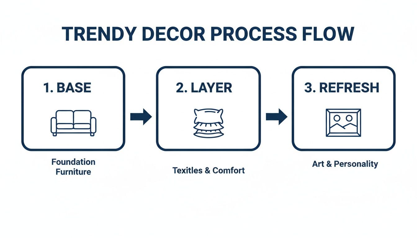
When you can see how the base, layer, and refresh elements all work together, you can create a palette that feels completely intentional.
Making Confident, Bold Choices
Once you have that visual confidence, you'll feel much more comfortable being adventurous. This lines up with a major shift we're seeing in interior design, where joyful, mood-boosting colors are coming back in a big way.
In fact, a 2023 analysis found that "dopamine decorating" completely flipped color trends on their head. Bold hues like mustard yellow and bright orange caused sales of grey sofas—which once dominated 60% of the market—to plummet by 42%. This mood-first approach was championed by 67% of designers, who started pushing for spaces saturated with joyful color. For you, this means you can use these tools to virtually test mustard yellow chairs against soft pastel walls and create a visual that feels both personal and on-trend.
By seeing a photorealistic preview, you are no longer guessing if a color will work—you know it will. This freedom allows you to experiment with palettes you might have previously considered too risky.
Whether you’re just testing an accent wall or re-imagining an entire room, this kind of technology is a game-changer. If you’re ready to see your own ideas come to life, you can start playing around with a free AI interior design generator today. Seeing the end result before you even pick up a paintbrush is the ultimate shortcut to creating a home you'll absolutely love.
Avoiding Common Color Selection Mistakes
You've done the hard work of choosing a decorating color scheme, but even the best plans can go sideways. I've seen it happen time and again. The biggest culprit? Underestimating how light completely transforms color.
That perfect, soft greige you fell in love with under the hardware store's fluorescent lights can suddenly look cold and purple in your north-facing living room. It's a classic mistake.
Natural light changes constantly, from the bright morning sun to the warm afternoon glow. Then, you flip on your lamps at night, and everything shifts again. This is exactly why testing colors in the actual room you'll be painting is non-negotiable.
The single best piece of advice I can give is this: Never, ever commit to a color based on a tiny swatch you looked at once. See it in its real environment to avoid a costly and frustrating mistake.
Here’s a simple trick I always recommend. Grab a few sample pots and paint them on large poster boards. Now you have massive, movable swatches. Tape them to different walls. Watch how they look in the morning, at midday, and at night under your artificial lights. You’ll be amazed at how much they can change.
Working With What You Can't Change: Undertones
Another common pitfall is completely ignoring the undertones of the fixed elements in your home. I'm talking about your flooring, kitchen countertops, cabinets, and even that big brick fireplace. These things have their own built-in warm (yellow, red) or cool (blue, gray) undertones. If you try to fight them, the whole room will feel slightly "off."
For example, painting cool, stark gray walls next to warm, honey-oak floors is a recipe for disaster. The gray will look jarringly blue, and the floors will scream orange. The goal is always harmony.
Here’s a practical approach to get it right:
- Check the Floors: Put your paint samples right on the floor. A warm-toned wood will look much better with a wall color that has a hint of cream, beige, or even a warm green.
- Analyze Your Countertops: Granite and quartz are notorious for having complex veins with multiple undertones. Find a subtle secondary color in the stone and pull it out for your wall or backsplash. It creates an instantly cohesive look.
- Look at the Cabinets: If you have white cabinets, are they a crisp, cool white or a softer, creamier off-white? You need to match that undertone in your wall color for a seamless, professional finish.
When you respect the elements already in your space, your new color scheme feels intentional and beautifully integrated. It's all about seeing how these elements play together, which can be tough to just imagine. Exploring a gallery of AI-generated living room design concepts is a great way to visualize how different wall colors will interact with your existing furniture and flooring before you ever pick up a paintbrush.
Answering Your Top Color Scheme Questions
As you move from a mood board to your actual living room, a lot of practical questions pop up. It’s one thing to understand color theory, but it's another to apply it to your own space. I get these questions all the time, so let's walk through some of the most common ones.
What's the Deal with the 60-30-10 Rule?
You’ll hear designers talk about this all the time, and for good reason. It's a simple, classic ratio for balancing color in a room so it feels harmonious instead of chaotic. It’s not a strict law, but it's an incredibly helpful starting point.
Here’s how it breaks down:
- 60% is your dominant color. Think of this as the main backdrop—it's usually your wall color. It sets the foundational mood for the entire space.
- 30% is your secondary color. This shade is there to add interest and support the main color. You'll typically see it on larger items like an accent wall, furniture, curtains, or a prominent area rug.
- 10% is your accent color. This is where you get to have fun and inject some personality. These are the small, vibrant pops of color you find in throw pillows, artwork, vases, and other decorative accessories.
Following this guideline helps give your color distribution a sense of purpose and keeps the eye moving comfortably around the room.
How Can I Pick Colors That Won't Look Dated in a Few Years?
This is the million-dollar question, isn't it? The secret to a timeless look is to anchor your space with neutrals on the big-ticket, hard-to-change items. Your sofa, large cabinetry, flooring, and even your main wall color are significant investments.
When you choose classic, versatile neutrals for these foundational pieces, you're creating a flexible canvas that can evolve with you.
Want to stay current without chasing trends? Keep your trendy colors on the accessories. It’s much easier (and cheaper) to swap out pillows, art, or a rug every few years than it is to buy a new sofa.
Is It Okay to Mix Warm and Cool Colors?
Yes, absolutely! In fact, you should. A room that leans entirely one way—either all warm or all cool—can often feel a little flat or one-dimensional. The interplay between different color temperatures is what creates depth, contrast, and visual interest.
The trick is to let one temperature take the lead. For instance, if you have a room with warm, creamy white walls and oak floors, bringing in cool-toned accents like slate blue or deep green creates a stunning balance. The overall warmth keeps the space feeling inviting, while the cool touches add a layer of sophistication and keep it from feeling too heavy.
How Much Does Lighting Really Change My Paint Color?
More than you can imagine. Lighting is probably the single most overlooked factor when people choose paint, and it has the power to completely transform a color.
A paint swatch that looks like a soft, warm gray at the store can suddenly look blue or even lavender in a room with cool, north-facing light. That same color in a sunny, south-facing room might appear much brighter and almost beige.
Don't forget about artificial light, either. The warm, yellow cast of an incandescent bulb will make colors look very different than the crisp, white light from an LED. This is exactly why you can't skip the final, most important step: testing large paint samples on your own walls and observing them throughout the day and night.
Ready to stop guessing and start visualizing? RoomStudioAI lets you test any decorating color schemes in a photorealistic render of your own room. See exactly how that new wall color will look with your existing furniture and lighting before you even think about buying a can of paint. Explore your design ideas with RoomStudioAI today!
Ready to redesign your space?
Try our AI interior design tool and see your room transformed in seconds.
Try Free Design

